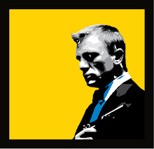
my favorite type of art is graffiti art. why? because there's something about its rawness that captures my interest as i'm in awe taking part in viewing one of these masterpieces. it's not the illegal aspect of graffiti that i like, but how these artists will go to such great lengths to create their art, even if it means stealing spray paint from their local hardware store.
i never knew that buying spray paint would be such a bone of contention until recently when i had to purchase a few cans myself, when they asked me to present my ID. apparently, you now need to be at least 18 years old to purchase spray paint. when did this start, and most importantly, why? right then and there it was clear to me how in this society, the public feels that graffii art has become problematic.
do i think it has? no, i don't. now don't get me wrong, i realize there's a difference between vandalism, tagging and graffiiti. but as an artist, my point of view is that graffiti is actually art, not just all the bright colors permeating throughout the piece that appears to be vandal and meaningless, but i love how the magnifying colors glows from afar. i love how their continuous use of color only brightens an area, not dulls it. whether it be a dilapidated wall, building, or even on the side of a train that travels through town heading its way to its next destination. i find it pleasing and i enjoy viewing it, if only for a brief amount of time.
but i realize i'm different because i've never really liked the 'fancy schmancy' type of art, but the rawness of street art as a whole. the kind of art that is displayed and for sale for an outrageous amount of money that not many people can afford, but as an artist myself, that has never been something i've enjoyed or even appreciated. i don't like that kind of art or its pretentious affluent perspective that permeates our souls—and our wallets—while we're viewing it at an overpriced art gallery. but for me, i prefer buying art off the street in NYC from a local artist who struggles through life and bills by selling their art on the street. as a struggling artist myself, i can easily appreciate their devotion to their craft and only wish i could financially support all of it.
one artist who became famous from this illegal street graffiiti was the late keith haring. haring was a master at his craft and never stopped regardless of it being illegal or not, because it was in him and he had to release his artisitic tendencies in order to persevere with what he believed in—street art. like most graffiti art, it brightened up a neighborhood with his dazzling colors and playful pop art designs. as you admire his style and his unique sense of playfulness, you can appreciate what he was trying to convey with his work.
nyc subway - 1983
as you can appreciate his cause and what he was trying to do, it was obvious that for haring, awareness meant everything to him, so much that he was willing to risk getting arrested (which he did on a number of occasions) just so he can paint to generate interest and understanding for the world to see. that's what was important to him.
growing up, haring was always inspired by other artists and began to draw what he enjoyed the most. in 1976, keith haring enrolled in the ivy school of professional art in pittsburgh to study commercial art, only to realize soon thereafter that becoming a graphic artist was not what he wanted to pursue, so after only two semesters, haring dropped out.
later that same year, haring enrolled in the school of visual arts (SVA) and moved to NYC where he soon touched upon a thriving art community—outside of the museum and gallery system, by producing his work in the downtown subway systems, streets, spaces in clubs and former dance halls. for haring, this was his calling. he quickly became part of the 1980s new york city street art culture.
tribute mural 50th anniversary created by haring in 1982 on
bowery & houston streets in downtown nyc
in 1980, haring found a unique opportunity that allowed him to communicate through a much wider audience when he noticed many unused advertising panels covered with black matte paper. for haring, this was the perfect medium for him to display and create his own style by using white chalk to cover the black paper as his means of communicating his work for the public to appreciate and enjoy—free art! between 1980 and 1985, haring produced hundreds of these public drawings, sometimes creating as many as forty "subway drawings" in a single day. these drawings quickly became familiar to new york commuters, who would often stop to engage the artist when they encountered him at work.
it was during this time that haring's work quickly exploded onto the NYC art scene.
according to haring, the subway became a "laboratory" for working out his ideas and experimenting with simple lines. his famous sense of artistic style that he became famous for.
both sides of the crack is wack mural on the handball court walls,
from the crack is wack playground created by keith haring in 1986
original haring artwork created on a vintage coca-cola sign, 1983
throughout haring's career, he devoted much of his time to public works, which often carried social messages. between 1982 and 1989, he produced more than 50 public artworks, in dozens of cities around the world, many of which were created for charities, hospitals, children's day care centers and orphanages.
in 1989, a year after haring was diagnosed with AIDS, he established the keith haring foundation which provides funding and imagery to AIDS organizations and children's programs. unfortunately on february 16, 1990, haring died from AIDS-related complications.
perhaps before we judge a graffiti work of art on public display, we should internalize what keith haring made aware to the public and what that message means, not just the outcome, but the communication that was meant to be interpreted.
keith, i will always miss your work, and your inspiration to all artists will carry on its legacy.
keith haring sculpture, 'three dancing figures' - san francisco, california 1989
keith haring — may 14, 1958–february 16, 1990