Friday, February 19, 2010

color in a beige world

i love color. i truly do. so it only seems appropriate for me to not just discuss how color makes us feel, but how it makes everything look and how it can brighten any room or decor!

i have always incorporated color into my home some way or another. and as i got older, i added more and more within my surroundings. it made me happy. it filled my world with bright, beautiful vibrant colors all around me. i have always believed that color can affect a person's mood or their overall personality when they're surrounded by it daily. color isn't just a visual mood, it's an emotional one, as well.

what we don't understand is, bright colors in the home aren't just for a childs room, but it can be ideal for the entire home as well. do you ever notice when you go into a home that is filled with beige walls and taupe upholstery, how it doesn't project the same feeling that it does when you walk into a colorful child's room? there's a reason for that. not just because there are toys strewn about, but because of the array of bright colors permeating throughout. it's a feeling that i cannot explain, but always like to convey visually.

you just know.

i admit, since i studied color theory in college, i am a bit biased on the subject, but i truly believe if everybody assimilated some splash of color into their home or office environment, not only would their frame of mind feel transformed, but their overall attitude would as well.
the use of color in your personal habitat can definitely bring a sense of sublime, and not just on an emotional level. as an artist, i have always been a firm believer in creating the type of surroundings that not only make you feel at home and at ease, but comfort.

which leaves me to ask—why don't the majority of people add more color to their interior environment? is it the fear that it could be too bold or a fear of being too overwhelming? or simply put, they don't know how? regardless of what the reasons are, give it a try—if not splashes of color here and there with maybe a colored vase, a colorful chair or ottoman, a small area rug—regardless of what you choose to add that little bit of bright to your life, color that you might not normally appreciate, can make a huge difference to your beige decor. even if white is your decorative hue of choice, adding a splash of color can brighten any room from afar.

so please, add some color into your life. you'll be happy you did.


pantone rubik's cube - color matching for nerds


fusion by wet water basin


Saturday, February 13, 2010

it's all in the package

as a graphic designer, i am frequently approached about my taste and opinion on specific things in life—color scheme, layout, where should i hang that picture—the list can be endless. but one thing i am never asked is how do i choose a specific product for my home. i'm sure it's under the assumption like the rest of society, that how we choose our favorite product is strictly based on its use which is suitable to each individual's needs.


unfortunately, this is where i differ from the average consumer. i am a little more choosy when it comes to picking my everyday household products, such as shampoo, dishwashing liquid, toothpaste—the possibilities are infinite. how i look at this dilemma is simple—if it looks good out in the open, i'll buy it. regardless of what i choose, the packaging is a huge contributing factor to my ultimate decision. i will even go as far as paying more for a product, as long as the packaging is "cool" and has the right look in my home. to most, this is a foolhardy approach when purchasing an everyday product such as tampons, but for myself—the quintessential artist and designer—i am much more particular.


there are reasons why the product companies go to such lengths to hire expensive—sometimes aloof—advertising agencies to design their next cool package. because they are in search of the few picky consumers like myself, only to fall prey to their beautiful, modern packaging in hopes of owning such a “masterpiece.” considering within each store, there is an overabundance of products to choose from. how does one choose? what better way than with cool packaging to “jump out” at the consumer.


as we know, this is the ultimate goal of a particular product and its advertising affiliates. but the majority of consumers don't care about how the package looks, but simply, how it works. i would say that advertising execs would refer to me as their "ideal consumer." going shopping in search of that ‘perfect’ bottle or box. intoxicated by the superfluous of bright colors on the shelves, looking out at me, wishing i would pick it up, if only for a moment, to appreciate and enjoy.


i immediately place it into my shopping cart beaming as i am en route to the cashier. i have—albeit momentarily—fulfilled my goal.


at times, i admit that occasionally i will have to bend my rules and purchase a plain and simple bathroom cleaner or deodorant, perhaps something a bit more user-friendly, if only for practical purposes. i assure you, they will be hidden out of sight with the rest of the ‘packaging rejects’ to not take away from my bright, polychromatic loft.


pantone colored buttons


innisfree

method mop by target


lisa & chad wine bottles


student project: erica hill
six fruit drink


student project: erica hill
spectrum art supply line


mugo mp3 player
designed by aaron atchison of feed the beast

cravendale milk


french rabbit wine

Sunday, January 24, 2010

pop art with a twist

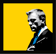
something i have become passionate about in these past few years is creating pop art pieces. whether it's a custom piece, a famous celebrity, or just your favorite pet, i enjoy sitting down in front of my computer, on my own terms, and creating these pop art designs.

since i am a graphic designer, i have always loved my field and my craft, but in recent months, i have become worn out on the daily criticisms and demands of the client-designer relationship. it can take an emotional toll on one's psyche, to say the least, but for the most part, the end result is more than satisfactory. this doesn't, however, deter me from finding a new passion within the same realm of digital art—but this time, it comes with a twist.

recently i discovered last year during a business trip to the new york stationery show, how i noticed what is HOT right now—silhouette art. i realize it's true with all things being cyclical, that seeing as the silhouette as an art form has been around since the 1700s, i immediately became intrigued with its update and facelift. with bright colors and flair to give it that "pop," i knew i had found my calling.

naturally, i started with my daughter as my first subject, and added a bright pink for the background and her name in a fancy script font—then voila! it looks gorgeous on the wall in her room. printed on gallery wrapped canvas and ready to hang, it gives the appearance of a masterpiece in your own home, for a fraction of the cost.

you can view my etsy shop here for more details on how to purchase one.


vector version

printed on gallery wrapped canvas - 1.5" borders


Sunday, January 3, 2010

my new addiction — world of warcraft

sad, isn't it? i am a grown woman, mother of one, wife of one, full time graphic designer, and i am still finding the time to sit down and play world of warcraft? yes, i'm afraid i do. i admit, being a graphic designer i love everything about cool graphics and the like. whether it be movies with special effects or an interesting website showing the talent of that particular web designer. i love it all!

additionally, what falls within this category are video games. they're everywhere and they're hot! it's the most profitable industry out there. i only wish i could have gotten a piece of that pie as the world of video games first appeared on the scene. maybe i was born during the wrong generation, but i always wish i could have had the education and wherewithal to learn everything there is to know in becoming a gaming designer. maybe it's something i would have grown tiresome of—which seems to fall within every job category these days—or maybe i would have actually loved my job and made great money at the same time? at this point in my life, these are answers i will never have. talk about endless nights in front of a storyboard.

all of that "wishing" aside, i recently started playing the mega video game, world of warcraft. now keep in mind, i have only been at it for a good week now and i realize there is much more to learn within this amazing world. for instance, i still cannot seem to figure out the whole goal and purpose of this game. is it to just gain more quests to go farther and farther within the game? is it the goal to try and explore and discover new "worlds" instead? i honestly have no idea. i have tried to read up on world of warcraft from their direct website as well as the creators, blizzard, but so far, i'm still at a loss.

admittedly, with most video games, when you start anew, there is always that frustrating learning curve you encounter on a daily basis until one day, you just get it! ahh the bliss and accomplishment of that moment.

we finally got the wii system for the holidays and being a person that loves everything and anything james bond 007, i bought the wii james bond 007: quantum of solace game only to be frustrated with my lack of shooting abilities. why can't i aim it properly? i seem to be aiming the gun in the air instead of at the villians. ugh! either way, i will conquer this quest to be proficient as a wii game shooter if it's the last thing i do! :)

for now, i will continue to enjoy the world of warcraft environment to which i have so become accustomed, and my character, 'kyraline', will prosper and go forward! i made the step to go from trial user to the full upgrade, so i think i'm ready!

wish me luck!


my world of warcraft character, "kyraline"


Saturday, October 31, 2009

england - everything i hoped and imagined, and more!

a few days ago, i returned from a two week long trip abroad to one of my much ancitipated countries, england. since i had never visited england before, i had always dreamed of visiting this beautiful country in hopes of discovering more history than i had imagined.

at first, i was nervous. mainly because even though it's an english speaking country, i knew i was in another country, and therefore i wanted to be as respectful as possible towards their customs and way of life. considering i had to learn a whole new way of currency (the £ vs. the $), and of course, driving on the left side of the road—which till this day, still added confusion and loss to my right side of the road driving perspective—but i still anticipated awe and enjoyment during my brief visit.

not only are the english very respectful and kind as a whole, i love listening to their eloquent accents compared to our american accents—which of course, all things relative, is what i'm used to here in the americas—but what i hadn't anticipated was that they thought i was the one with the accent. go figure!

all kidding aside, i stayed at a quaint hotel located in the city of brighton overlooking the sea. it was bliss all the way around. i frequently walked around in the evenings and soaked up the energy that filled this urban town and continued to enjoy the sights. on the weekend, i took the train from brighton to london and per usual, did the "cheesy" american tourist-thing. i had always dreamed of visiting buckingham palace, big ben, et al, so even though pictures cannot describe the beauty and detail in the ornate historical architecture surrounding the city of london, i took many pictures to capture my trip, nevertheless.

enjoy!

buckingham palace

gates to green park (across from buckingham palace)

big ben - house of parliament

tower of london

underground subway (the "tube")

going across the london bridge

view from the london eye (i believe we were at the top)

another view from inside the london eye

busy street!

lucky i caught one of these original red double-decker buses. they were recently retired and now you mainly see newer ones, so this was a rare treat!


and of course, last but not least – the apple store on oxford st.


Sunday, October 4, 2009

stephen sprouse (1953–2004)


stephen sprouse

stephen sprouse was one of the most innovative and unique fashion designers of his time. he was not only a fashion designer, but an artist. stephen studied fashion design at the rhode island school of design, but never finished. he got his start by interning for veteran designer, bill blass when he was only 14 years old. at the age of 18, stephen worked as an assistant for coveted design haute couture, halston. a much coveted position and visionary enabled stephen to branch out into his own business, thanks to the financial backing of his parents—stephen sprouse, inc. was born in 1983.

gorgeous style with bright, bold colors


although his business was rocky to start, his experience working for such credible and well-known fashion design houses gave him much admiration and support from famed artists andy warhol, keith haring, bergdorf goodman, diesel jeans, barney's new york, marc jacobs for louis vuitton and his long time friend, debbie harry (from the 70s pop group, blondie).


window display


in 2001, marc jacobs called stephen with an idea for a new, bold and innovative idea for stephen to design a graffiti line of monogram pieces for louis vuitton. at that point, stephen sprouse was reborn and recognized by the masses. needless to say, it was a huge success and sold out immediately.

stephen sprouse graffiti louis vuitton monogram canvas keepall


in 2004, at the age of 50, stephen sprouse passed away from a long battle with lung cancer. even though he will truly be missed and be respected as one of the top designers of his time—thanks to his bold use of colors mixed with his pop art style—we are lucky to have the advantage of enjoying his wearable art; not necessarily as a collector's item, but to love and enjoy for years to come.


in january 2009, authors roger padilha, mauricio padilha and tama janowitz published an inside pictorial book to showcase stephen sprouse's art and fashion design throughout his years as an artist and a designer. this book is truly a collector's masterpiece and as a personal tribute, i leave it on my coffee table so i can peruse it every day.

there are four different colors available for the book jacket


when i lived in new york city from 1988–1990 while studying graphic design, i used to frequent the art galleries and boutiques down in soho and the village. i loved going to keith haring's POP SHOP on lafayette and houston on a regular basis and while walking on my many travels downtown, i stumbled upon stephen sprouse's boutique which at the time, was unfortunately going out of business. to my surprise, their sale was incredibly affordable and i was able to acquire many pieces from this iconic designer. if not to prey on the business' demise, but because finally, as a starving art student, i was able to actually afford some of his most popular pieces.


sketches by stephen sprouse

in 2003, to my regret, because i was no longer able to wear these beautiful pieces, i sold all of my stephen sprouse clothes on ebay. instead of saving them in hopes of one day being able to wear them again, i felt at the time, that it would be a more financially responsible decision if i could make some decent money, which i did. however, 6 years later, i regret every minute of it, especially that one signature piece, the sequined dress (at least i have a picture of me wearing it for halloween in 1989 as a 60s go-go dancer).

i miss you stephen sprouse, and i miss what could have been produced 5 years after his untimely death, because at the time, in the early 80s, you weren't appreciated for your original concept, but for your bold designs. this is for you, my personal tribute to a designer and an artist.